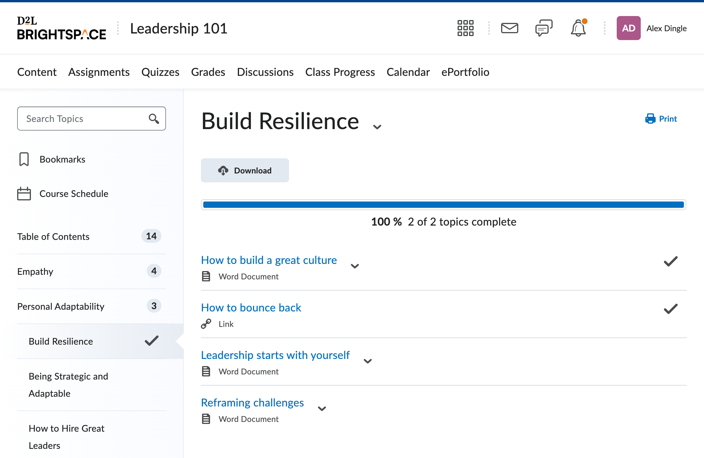
Visual polish of a core user destination
The most important page in the product is where learners go to view their learning materials. Over the years, the page had grown busy and cluttered. This was a quick project to develop a cleaner, more focused view.
The design goal was to provide an "immersive" view that focused on a single lesson's activities at a time, and collapsed the rest. This is particularly useful for elementary students who require guidance and focus while working online, and adult learners who may have multiple tabs and distractions to deal with. A key goal was also to attract publishers with an experience that put the textbook content front and center.
It seems simple, but involved careful choices of spacing, type heirarchy and indentation to ensure the structure stayed clear.
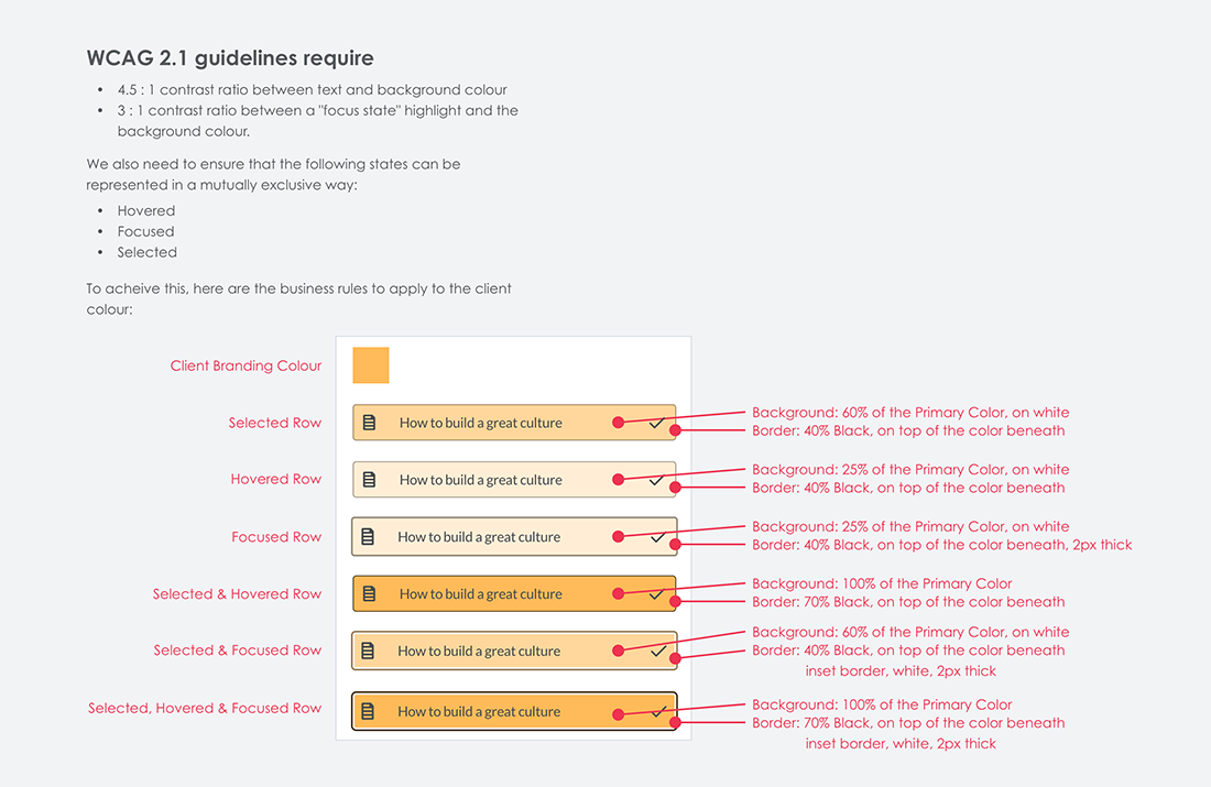
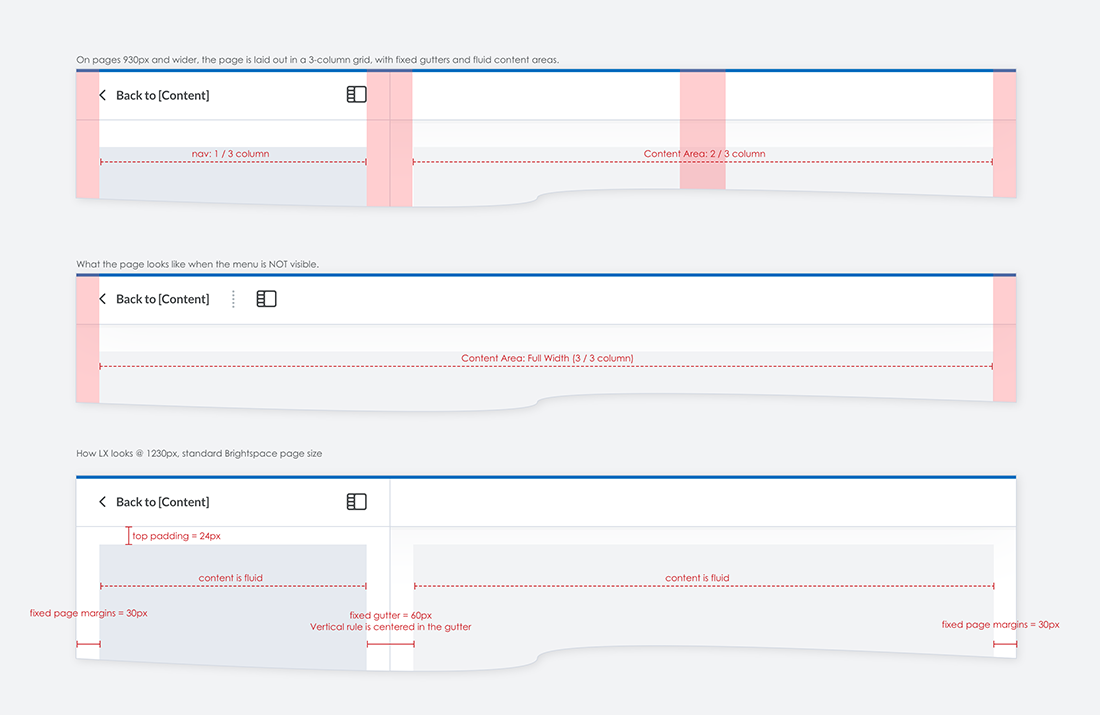
The process was short, done on whiteboards (no photos, sorry!) and involved quick design reviews with the team. I've included some examples of how I spec out this kind of work for the dev team.