A project to redesign the quiz authoring experience in Brightspace
Brightspace is a learning management system. Teachers use it to create course material and assess learners. One of the most common and popular ways to assess a learner is by having them take a quiz.
Brightspace's quizzing tool hadn't been touched in around ten years. During sales pilots teachers would try it and find it difficult. The poor experience was contributing to sales losses pretty directly. This was one of the rare times where improving usability was the primary motivation for doing the work.
I led the design process while collaborating with and mentoring my friend Nicole as the co-designer on the project. We worked with a product manager, a dev manager and a team of about six or seven engineers and QA analysts.
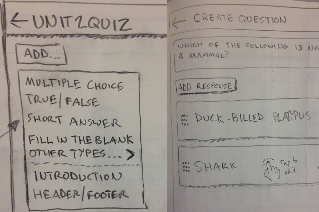
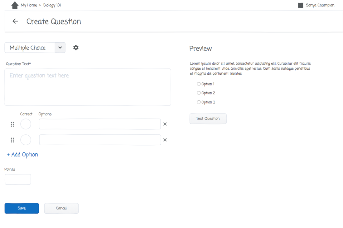
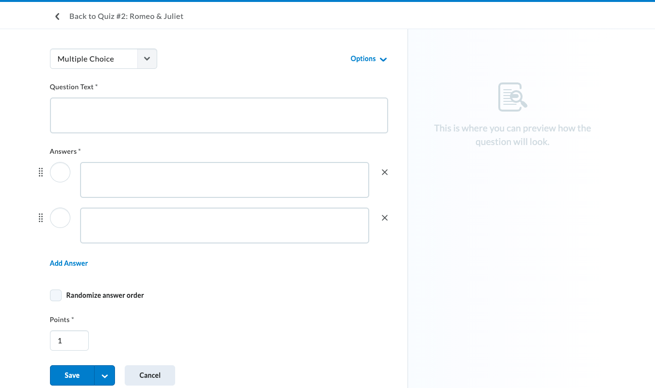
I've included a handful of screens and videos of the design at various points in the process below.
This was the original screen before the redesign: a very old, long, overwhelming page filled with settings that users did not always understand.
One of the first things we did was kick off a session with product manager and developers on the team. Here I am running an assumption-gathering workshop which helped us prioritize our first areas of focus.
After determining where we would start, I worked with Nicole on brainstorming a simple page pattern that we could use as a basis and framework for all the various question types. We did a ton of sketching and sharing, going away and then coming back together until we had an idea we were happy with.
Once we were happy with a direction, we wired up a prototype to start testing with users. We used Sketch and Axure, but kept things deliberately low-fidelity.
Over time and through testing with users and exploring BI data from production, the details of the design evolved. We experimented with which options should be visible vs. progressively disclosed vs. straight-up removed.
Here is what the final design looked like for authoring a quiz question. Much clearer and easier to understand!
I created motion studies to explore different the details for certain interactions. These eventually became CSS code for the developers. This was created in a tool called Principle.
This is what the final workflow looks like for creating a quiz question, coded and in production. We worked closely with the developers during implementation to make sure the details were as-expected.